A "Snapshot" of your Business. A One Page Website with Creative Flair.

Justin Jenkins Designs • June 10, 2021

Creative. Bold. Simple. Stand Out with One Page. 
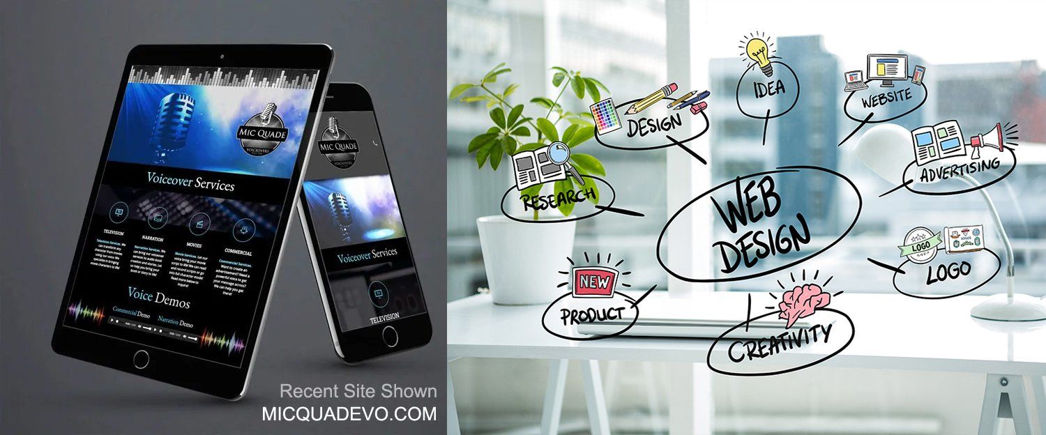
One Page Website Design for MIC QUADE, LLC. by Justin Jenkins Designs. A "snapshot" of the Voiceover Company that is bold, creative, unique, and stands out. Better yet, its simple to navigate and focuses on the business mission. 


A One Page Website? Why? How? 


I know what you're thinking as you read this. How can I put all my information on one page? I run a  business and need multiple pages to make it work! A lot of web pages is good, right? I just don't see a one page website being enough and won't that hurt my traffic and ranking on google and yahoo? 


Ok, we listened. We hear you. But, not so fast. 

Let us explain the amazing benefits and why having a one page site can actually increase sales and keep people coming back!


I have been building sites for decades, and started on AOL building sites for clients! We have come a long way since then, and believe it or not, I've seen remarkable trends over the years from: 


A. C luttered link trees; 

B . Large amounts of web pages (again, was trendy for search engine rankings); 

C. Lots of text and links (internal and external) for search engine formulas; 

D. Backlinks with PR 7 or higher

E. Large Graphics & Video


Fast forward to 2020. We see trends toward video, large beautiful HD pictures, less text or reading, more streamlined balance between creative fonts and visuals, and a responsive need that has to respect mobile and tablet use.


For me, these trends all point to something inescapable. The need for a super creative but not overly complex gateway to your idea, company, product, or service. Beautification of a website?! YES. Those who have creative websites that are organized, simple, yet convey a straightforward and focused message to visitors will win the day. Not only win, but keep them coming back through fresh updates, bold changes, and a fun creative approach! Nothing spells DISASTER more than a website that isn't optimized (fast), easy to navigate, and creates a very inviting, fun, and interesting window into your mission. 


Here is the Good News. We no longer have to worry that having a one page website can decrease our chances of getting a high placement in the search engines. It's not about quantity anymore. Its about QUALITY. Yes, you heard that correctly. I really dont need thousands of links or pages to get ranked high and more visitors? Absolutely not. What you do need though is to keep your message on point and synchronize the images, video, and text to a cohesive unit that simply tells your audience EXACTLY what your mission is. This is where a one page site can have amazing benefits and keep the creativity very high as well!  A one page site is not exactly a new trend and it has been building more for the last 5 years. The search engines DO NOT penalize for these types of sites and, in fact, give a one page site that is built and structured correctly just as good or better a chance to get a high ranking than a huge 500 page corporate site. So why then shouldn't we all start taking the one page site seriously! Maybe its a trend we cant break yet? Maybe some are scared it wont be enough? Maybe its too simple! Less is more, right? 


At Justin Jenkins Designs, we see an opportunity here for many small and large business owners, artists, musicians, product offerings, marketing pages, and many other faces in the crowd looking to stand out in a creative and simplified way! 

With many tools at the disposal of website designers, condensing products into retractable windows (think accordions), and using space to maximum efficiency, the growing importance of responsiveness suggests many important develops around space constraints and utilizing such features as the accordion drop downs. Creativity becomes a huge factor in this harmonization of the elements and can make or break a website design. 


These are just some of the important benefits of a ONE PAGE WEBSITE:


A. Easy navigation for visitors -  No more external pages and multiple clicks.

B. Simplify your message and mission - one page forces you to get rid of clutter.

C. Compartmentalizes your business - A natural flow down the page creates clarity.  

D. Balance between Visuals and Text -   High definition images dont clash with text.

E.   Simple and Clean - visitors will love the smooth flow of info. and experience. 

F. Creativity over Quantity - Sometimes creativity and beauty get lost in a huge website. 

G. Great for Responsive Design - A 1 page site can be a work of art for mobile viewing


I want to conclude by saying a ONE PAGE WEB DESIGN is not for everyone. But it should be. Its easier on the brain; easier to navigate; leaves room for a lasting impression; doesn't overwhelm your visitors. It can be a work of art if designed correctly. In fact, I treat every one page clients one page website design as a work of art that enhances their brand while keeping it simple, yet timeless. The future could be the one pager. Who knows? Mobile phones are demanding more out of the internet and knocking on the door of change for designers all over the world. Could the one page design keep it simple yet become a super creative powerhouse for websites. A website is your window for the world to peek inside. What will they see? A thousand rooms full of lots of furniture? Or a simple , clean, beautiful environment they feel comfortable making themselves home in?  Time will tell. Until then, why not jump on this bandwagon and get your own one page site! You deserve to stand out! Visit us here at justinjenkinsdesigns.net


Blog entry by: Design Team Lead Justin Jenkins at Justin Jenkins Designs

Featured image:   MICQUADEVO.COM website design by Justin Jenkins Designs

Designed by: Justin Jenkins Designs

justinjenkinsdesigns.net
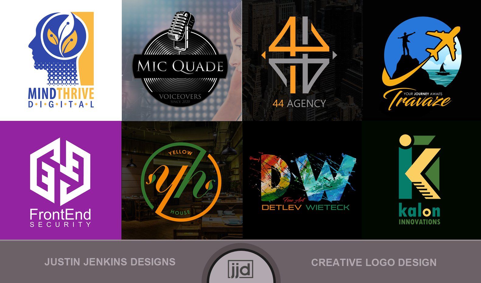


Award-Winning Logo Design by Justin Jenkins Designs NYC
By Justin Jenkins February 21, 2023
A well-designed logo takes into consideration the durability, functionality, and how "sticky" it is in the minds of the consumers. When we talk about "stickiness," we reference how well it can bridge the gap between the product and service the company offers in relation to their brand identity. The company logo is at the forefront of this influence.
Inspiration is everywhere. The Creative Fire is fueled by the endless beauty of life.
By Justin Jenkins Designs May 13, 2021
Inspiration is everywhere. The Creative Fire is fueled by the endless beauty of life. The Packaging Design I recently created for the Documentary, "Immortal," left me thinking about unsuspecting inspiration.
Embrace Client Interaction During the Design Process
By Justin Jenkins Designs June 16, 2020
I recently had a meeting with a client that told me that they enjoyed getting involved in the design process. It made them feel as though they were contributing to their design and it felt satisfying connecting with the design team during the process. After all, it was their initial idea that started the branding in motion, and it just seems natural to have them contribute ideas and endless feedback. This made complete sense to me as a designer. This is not to say that designers out there dont get clients involved, but how far do they actually go to make sure the client has a completely open arena for honest expression? To answer that question and many more , we need to analyze the designers attitude from the start. Sometimes as designers, we get so caught up in taking over and trying to create that perfect image for clients, that we end up leaving out the client entirely. This is where designers lose sight of an important part of the client / designer "collaboration." Blinded by their confidence and allowing the design to rest solely on their skilled shoulders, they forge ahead through phase after phase, hearing feedback, but ultimately relying on their own instincts to see the design home. Shutting the door on a client once the process has started through minimal meetings and quick reviews does an injustice to the client. Rather than allowing the client to comfortably express the full extent of their opinion and viewpoints, designers sometimes shut out the feedback and continue to plod along convinced the end result will connect with the client. Sometimes this works and they hit a home run. Many times, they look back after endless mockup phases and wonder why its taking so long. Is this really that bad? How come I cant connect the ideas to the result? Did I miss something? Endless questions circle the mind. The truth is, the most powerful question of all is: What does my client think? This translates to listening carefully, being open to any criticism (large or small), and allowing the client to feel at home in their reviews. A lot is at stake here - It's their future and the face of their company or the packaging for their product(s)! The lesson here as designers is to never think we are so talented and experienced that the idea or feedback from a client cant be worth their weight in gold. We should never lose sight of the fact that is their design and ultimately they have the last say in the process. A few essential things that we all need to implement during the design process to strengthen the designer / client collaboration: 1. Allow Honest Communication From The Client. Make the client feel at home with you and your team. Openly express to them that you welcome their input as much as possible throughout the design process. Never make them feel that they are inferior or uncomfortable. They hired you and trust you. In short, they have complete faith in your abilities, but want freedom to give their own ideas and input. This is their future and design in the end. 2. Keep The Channels of Communication Open. Give your clients direct access to you or a team member on a daily basis. Provide timely responses through all communication channels and maintain a positive and open attitude for all back and forth ideas! Embrace the clients input and flexibility, while providing concrete reasons why or why not a design element works, etc. Giving them a sense of worth throughout the process empowers them with a connection to not only the design, but with you and your team. Ultimately, it is the designer who explains the reasons behind design decisions and why it will enhance the clients brand. They want to sail with us on the design journey, but we are ultimately the captain(s) guiding them safely and confidently to shore. 3. Update them Often. Giving your clients daily feedback on your ideas keeps them up to date on the process and what you are thinking. It also allows creative interactions between your solutions for them and how they respond to the ideas. Its easy to limit collaborations during design, especially considering many creatives need time to think and work. Quiet reflection and analysis without too many distractions can lead to creative breakthroughs. This works well in all creative arenas, but when a client is involved and has hired your creativity, they need to understand and connect with your ideas and process. Unlike paintings or drawing, designing can be a team effort that usually involves a client or clients on the other end of the creative inspiration. 4. Conclusion. Our clients are the backbone of our success. They come to us because they believe in us. They do their homework, research, and eventually have to choose a designer to see their vision through to reality. We as designers owe them time and ears to listen throughout the creative process. Without their constant input and feedback, the project could become derailed and lose its effectiveness. Yes, we are designers because we know how to create designs with impact that benefit our clients in a big way. But without the clients mental process and what they are thinking about their brand idea, etc., the project would be missing a very critical component. I find the process as rewarding as the final result. I learn from my clients and they learn from me. Weekly Blog Post by Founder and Head Designer Justin Jenkins Justin Jenkins Designs justinjenkinsdesigns.net
By Justin Jenkins Designs June 8, 2020
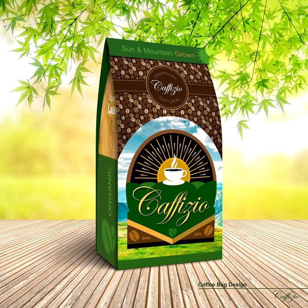
All of us have experienced the impact of effective design. As we slowly walk the isles of our local supermarket, a world of typography, color, and imagery greets our senses with an inviting smile that packs tremendous force. Unaware of this power, we walk along without realizing the vast scope and impact of what is going on between the isles. The emotional connections and triggers that are unfolding are actually competing for our attention. This hold on us is actually strategically creating a desire for us to not only fall in love with a product, but ultimately keep us coming back for more. This battle for our attention starts in the design rooms of agencies and studios across the world. This is what Branding Design does to consumers. Great Design analyzes trends, colors, and the impact of typography on attracting and retaining consumer desire. Simple or complex? Colorful or Black and white? Large Imagery or Small? All these questions pose a mystery that Designers over decades have been trying to unlock. What is the magic formula to attract buyers and grow sales? They answer lies somewhere between the analysis of buyer predictability and the effects of color, words, and imagery on human senses. When all the data is collectively analyzed, the design team begins the journey of putting all the pieces together into an attractive and sustainable design. At this stage, the experience of the team and knowledge of the product aims to target a packaging that brings to light the best possible attributes of the product to the consumer. It also aims to exceed it, and bring the product to new levels of interest through desire and attraction. The consumer needs to connect with it. This happens through strategic colors, imagery, and typography. Yes, as we all know, there is a battle between products as consumers feast their eyes upon isles of packages deciding which of them stands out. Of course there are many other factors that entice consumers to buy, such as ingredients, safety, and durability. But it is the packaging that has an immediate impression that starts the buying process in motion. As a product owner, you don't want to be hidden behind less than stellar packaging design. The next time your out shopping, check out the packaging design. Be aware of its design. Many of us become so engaged in the curiosity of a new product and seek out the confidence to buy into it, that we don't realize the power of packaging design and its effect on our senses and eyes. It can really make the difference in the buyers experience. We are aware we connect with the product and love it, but subconsciously many factors are at play that started that love affair in the first place. Try analyzing what lured you into a product. Was it research before shopping? Did the packaging drive home your confidence even more? Did the design reinforce your desire and connection? Think about this next time out. Behind every product there is a team of designers working hard to help companies and owners win your attention. Blog entry by Justin Jenkins Designs Featured image: Caffizio Coffee Packaging Design Designed by: Justin Jenkins Designs justinjenkinsdesigns.net
Share by: